
Transforming Workspot’s brand to build a powerhouse identity.
Workspot
Workspot undertook a comprehensive website rebuild that presented an ideal opportunity to refresh and modernise the brand identity.
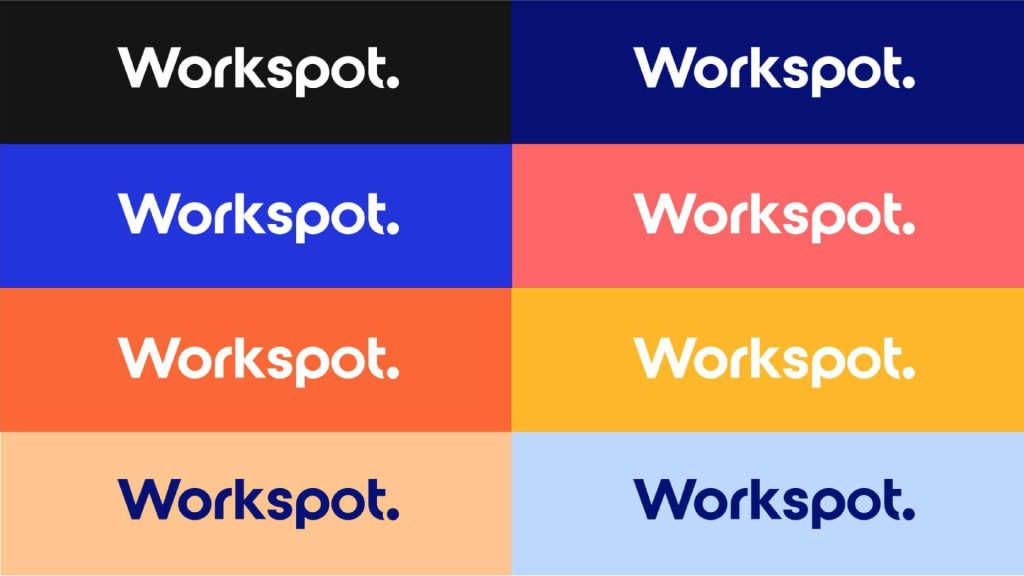
The project encompassed a complete evolution of the visual system, including the colour palette, typography, brand mark, and visual language. This strategic refresh was designed to bring the brand into contemporary design practices whilst maintaining the recognition and equity that Workspot had already established in the market.

The challenge
The central challenge lay in balancing modernisation with preservation. Whilst Workspot’s logo had achieved strong recognition, the existing two-tone approach and visual system felt dated relative to current design trends. The team needed to create a more distinct and flexible brand identity that could support richer creative applications across digital and print communications, without abandoning the visual elements that made Workspot familiar to its audience. Additionally, the brand’s visual toolkit lacked the flexibility to communicate the full range of product capabilities and features effectively.
Our approach
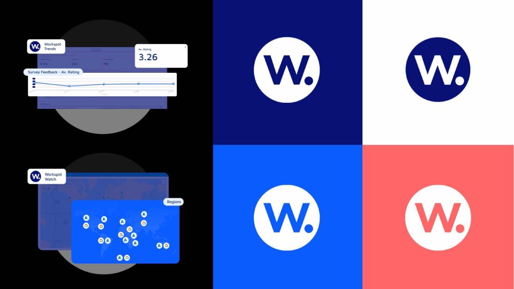
We focused on thoughtful evolution rather than radical reinvention across every element of the visual system. The logo received a light touch revision, shifting from the two-tone version to a modern single-colour option whilst keeping the core ‘W’ mark recognisable. The colour palette was modernised to remain sympathetic to established colourways whilst introducing breakthrough shades, including a signature pink that would add distinctive punch to communications. The team developed a comprehensive icon library in both outline and fill versions, designed for instant recognition and flexibility across applications. Building on this foundation, stylised illustrations were created for each product capability, utilising the full spectrum of the colour palette to ensure visual consistency and clear communication of functionality.
The solution
We delivered a cohesive and contemporary brand system that provides Workspot with a substantially larger creative playing field for future communications. The modernised logo maintains brand continuity whilst feeling fresh and intentional, and the vibrant icon library and extended illustration system bring playful engagement to the brand whilst maintaining professional clarity. Existing diagrams and materials received a light touch update through the new icons and refined design language. Together, these elements create a stronger, more flexible visual identity that supports the redesigned website and establishes a foundation for consistent, confident brand communications moving forward.



Great products, great people.Richard JonesDell Technologies
I love working with Fuel. It's always refreshing to work with Fuel as they always listen to their customer.Alisha PerkinsAMD

How we restructured ControlUp's website and product hierarchy.

A vertical showcase for Issuu's diverse digital product.
Sorry, no content currently available
Please check back soon!