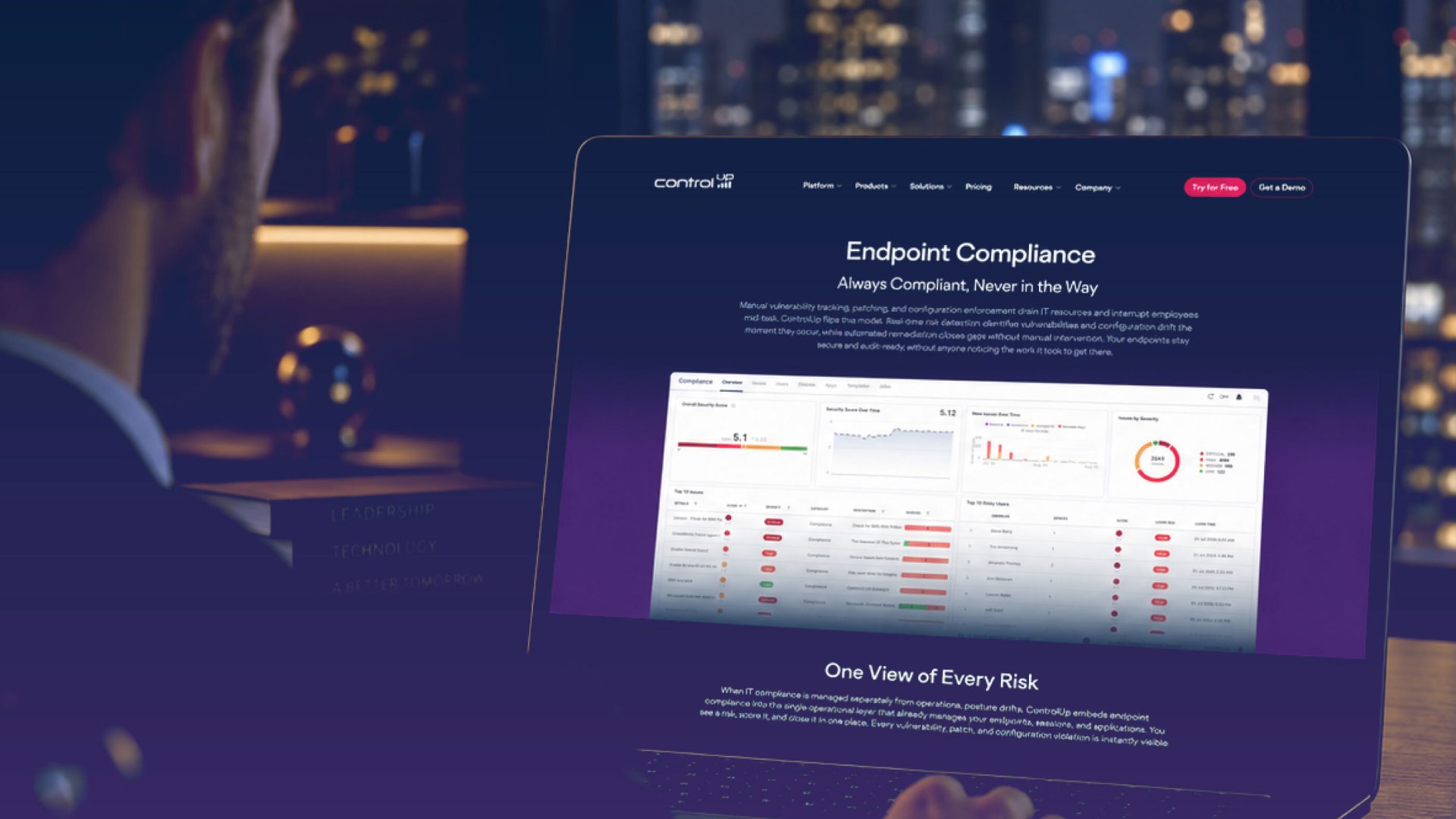
Bringing clarity and structure to ControlUp's evolving product story.
ControlUp
UX, clarity and structure for ControlUp’s product story.
ControlUp came to us at a time of rapid change, with a growing product portfolio and a brand hierarchy that had become difficult for both customers and internal teams to navigate. The project centred on a complete rethink of how the website was organised, from the top-level navigation through to individual solution pages. Working from ControlUp’s web audit, we developed a logical and future-proof structure for the website and product hierarchy, then carried it all the way through UX, copywriting, design and launch in close partnership with their internal teams.

The challenge
The central challenge lay in creating order within a landscape that was constantly shifting. ControlUp’s product offering was evolving for the better on a near daily basis, which meant the existing site structure no longer reflected how the business wanted to present itself or how customers needed to find information. Products and solutions overlapped, content was spread across multiple pages with inconsistent messaging, and the brand hierarchy lacked the clarity needed to guide visitors towards the right solution. Any new structure needed to solve these immediate problems whilst remaining flexible enough to absorb future changes to the product portfolio without requiring another rebuild.
Our approach
We began with a comprehensive review of ControlUp’s web audit document, using it as the foundation for a clear and logical product and website hierarchy. From this, we designed a mega navigation structure that could accommodate the full breadth of the offering in a way that felt intuitive to users, alongside a set of templated page frameworks built to scale as new products and solutions are introduced. We worked up the UX and page flows, contributed to wider journey planning, and created UX outlines and frameworks in Figma to give every stakeholder a shared view of how the site would work. The copywriting was approached with the same rigour, with some pages written from scratch, others rewritten to reflect new product information, and several amalgamated from multiple existing pages into single, more focused destinations.
The solution
We delivered a restructured website that gives ControlUp a clear, coherent way to present its products today and a robust framework to grow into tomorrow. The new mega navigation and product hierarchy make it far easier for visitors to understand the offering and find what is relevant to them, whilst the templated frameworks allow the ControlUp team to add and adapt pages with confidence as the portfolio continues to evolve. We designed the solutions pages and created bespoke visuals to support them, and worked collaboratively with ControlUp’s development, product and marketing teams throughout the build to make sure the go-live product was right. The result is a website that brings structure to a fast-moving business and provides a lasting foundation for its future communications.


I love working with Fuel. It's always refreshing to work with Fuel as they always listen to their customer.Alisha PerkinsAMD
Fuel has been instrumental in helping Nyobolt build a brand that truly reflects the ambition and innovation behind our technology. From visual identity and campaign assets to digital content and event materials, they handle a broad range of work for us — and consistently deliver to a high standard, always at pace.George KapellosNyobolt

Explore how subtle design decisions and visual coherence transformed Workspot's brand maturity.

A vertical showcase for Issuu's diverse digital product.
Sorry, no content currently available
Please check back soon!