
Creating a strong visual language for ControlUp's global kick-off.
ControlUp
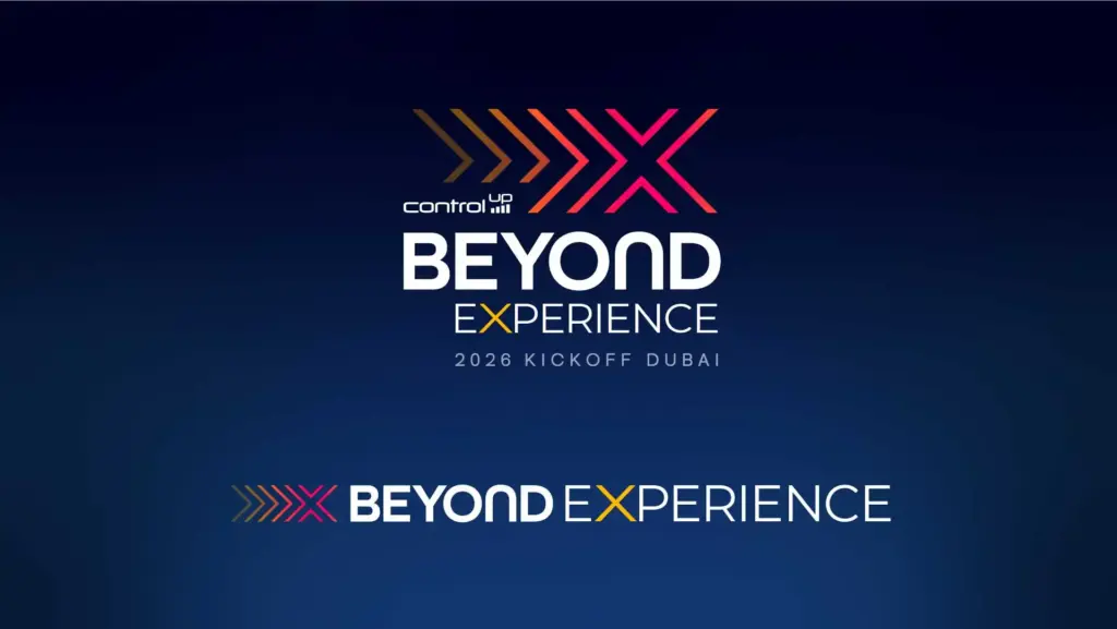
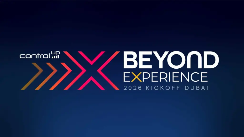
We developed a bold initial concept and brand mark for ControlUp’s kickoff event, designed to set the tone for the entire year’s worth of events and communications.
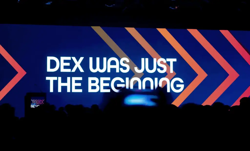
From opening videos and speaker graphics to every surface in the venue, we created a cohesive visual identity that turned a company gathering into a polished, high-impact moment.
Services:
Signage design, Motion graphics, Video production, Venue branding, Copywriting
The challenge
ControlUp’s kickoff in Dubai was meant to be a milestone moment for the company, setting the direction and energy for everything that would follow for the next twelve months. They needed a visual identity strong enough to anchor the event itself while remaining flexible enough to extend across future communications, partner materials, and marketing initiatives. The branding had to feel both bold and professional, energising without being gimmicky.
The approach
We developed a distinctive visual system that started with a powerful logo concept and brand mark, then cascaded that identity across every element of the event experience. Custom motion graphics were created for opening content and speaker introductions, ensuring consistency while keeping things dynamic. Copywriting reinforced the brand voice throughout, from signage to presentations, creating a unified narrative that made attendees feel they were part of something intentional and well-crafted.
The solution
The unified branding elevated the event into a polished, high-impact experience that resonated with attendees and gave internal teams something to rally around. Every touchpoint reinforced the same visual language, creating a sense of cohesion that made the event feel premium and intentional. The brand system we established became the foundation for the year ahead, ensuring consistency across every future communication and extension of the ControlUp brand.


I love working with Fuel. It's always refreshing to work with Fuel as they always listen to their customer.Alisha PerkinsAMD
Great products, great people.Richard JonesDell Technologies
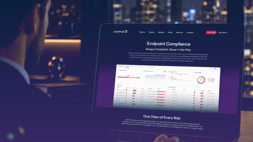
How we restructured ControlUp's website and product hierarchy.

Explore how subtle design decisions and visual coherence transformed Workspot's brand maturity.
Sorry, no content currently available
Please check back soon!